What’s the first thing HRs, recruiters, or people will notice when they land on your LinkedIn profile? Yes, they first see your profile, headline, and LinkedIn banner. Whether you are looking for a job, a startup, or an entrepreneur, having a well designed-attractive LinkedIn banner will set you apart from the LinkedIn crowd. In this blog post, you will go through tips and guides to design a perfect banner for your LinkedIn profile!
Why Is Your LinkedIn Banner Important?🤔
LinkedIn is not like other social media platforms where you can post randomly, LinkedIn is regulated towards professionalism. So, your LinkedIn banner plays an important part in reflecting your professional oneness. It tells the viewer all about your skills and services at a glance. So the banner should be made with utter professionalism and creativity. A clever and smart banner can:
- Risen your profile views by engaging attention.
- Amplify your personal brand by communicating your skills and expertise.
- Creates a good positive first impression with your clients, partners, or recruiters.
Banner Size and Dimensions
Before jumping into the design tips, it is very important to have the right dimensions of the banner. The recommended banner size by LinkedIn is 1584 x 396 pixels. LinkedIn scales the banner size differently on different devices, so make your banner size according to both laptop and mobile. Keep the elements centered align to avoid unintentional distortion and cropping.
Key Elements of a Perfect LinkedIn Banner
- Clear message or branding: Your banner should straight away reflect who you are, what you do, and what facilities you provide. Whether you are
displaying your brand, skillset, or company’s logo, make sure that the message is clear. Keep it short and crisp, to the point to avoid overwhelming the viewer. For example, if you are a graphic designer then your banner could include keywords like “UI/UX Designer“, “Illustrator“, “Visual Artist” or “Branding Specialist“. This helps the clients looking for a particular position shortlist your profile easily. - Professional Aesthetics: The aesthetics of your LinkedIn banner should be professional yet attractive. Avoid using flashy colors like red, orange, etc. Don’t use funky typographies or clustered images. Use formal images of yours, and avoid using casual ones. Design a balanced setup or layout and keep it as simple as you can. For example, if you are in the tech industry, neutral tones would be an excellent choice.
- High-Quality Images: Always use high-resolution images for a polished banner. A low-quality image on your banner will leave a poor impact on the viewers. You can either use royalty-free images or create your own graphics and illustrations with tools like Canva, Adobe Spark, or Figma.
- Call to Action (Optional): If you’re a part of a company, startup, or a service that you are promoting then you can include a call to action(CTA) in your banner. You could also include a URL to your portfolio or a tagline that would motivate visitors to connect with you.
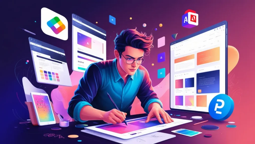
Tools to create the banner
To design a banner you don’t need to be a professional designer or graphic designer. These tools will help you make a perfect banner like a pro:
- Canva: Canva contains pre-designed LinkedIn banner templates, which can be customized with appropriate texts, colors,
and images according to your design. - Adobe Spark: If you want your banner to look more creative and illustrative then Adobe Spark would be the right tool for you. It will provide you with more creative freedom.
- Figma: This tool is my personal favorite, the reason being its simple and user-friendly interface. Whether a beginner or a professional, it is suitable for every type of user. You can experiment and make a perfect banner like you wish.
Common mistakes to avoid ❌
- Too much text: Don’t over-accumulate your banner like a billboard. Try to focus on either one or two cards.
- Poor Image Quality: As discussed before a low-resolution image shows unprofessional behavior. So always use high-resolution image.
- Cluttered Design: Don’t overload the banner with too many designs. Keep it simple and focused.
- Ignoring mobile users: Don’t think that people won’t visit your profile through mobile. Every possibility is possible, so make sure your banner is mobile-compatible and doesn’t look cropped.
Final Thoughts💭
Your LinkedIn banner is that powerful element that changes your whole LinkedIn game. Many people ignore it, but it’s a fact that what people see is what they buy. So read our blog, follow the guide, and make a professional banner aligned with your career goals. Take your time, and rule the kingdom!