Recently, Instagram has become a perceptible story-telling platform. That Is why standing out in its high image-driven and attention-seeking environment is both an art and an expertise. The challenge is creating content among millions of creator posting photos and videos daily , which not only resonates with the audience but also is attention-grabbing. There are a numerous design tools you can use to design noticeable and impressive Instagram posts. In this blog post, we’ll be uncovering the secrets to designing Instagram posts that will stand out in the feed.
We will be using Figma throughout the blog, so if you are not familiar with its interface than read this blog to get to know about the basics of Figma:
🌟Understand Your Audience
Before we start designing our Instagram posts, it’s important to know our audience inside and out. In order to meet their expectations and increase your engagement few tactics like analyzing their interests, behavior, and choices will help shape your content. Instagram has an insight tool that can be used to collect data on your follower’s demographics, their active hours and the type of content or posts they interact with most. By incorporating this, it will lead you through design choices and will increase engagement on your Instagram posts.
🌟Consistent Branding
Brand consistency is the key to making a noticeable appearance on Instagram. But what exactly is Brand Consistency? Well, it is defined as an aspect that influences the way the audience thinks about your brand/business. Having consistency means that your audience is constantly and regularly being exposed to your brand and its features. You might have seen many ads that appear almost daily on your Instagram, or any other social app. Why do they do that? Well, that is what they are doing- consistent branding! Once the users know what your brand value is aur what services you provide, they will connect with you and this will engage more audience toward your brand.
Maintaining a consistent color theme or using a consistent design is very important for engaging audience. We will tell you about how you can create Instagram
posts that will not only grab attention but also increase your branding.
🌟Setting Up Your Canvas Using Figma
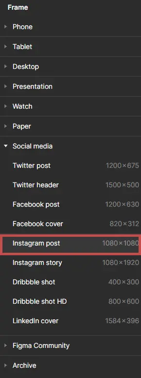
Start by setting up your canvas in Figma. Instagram posts are typically square, with an ideal resolution of 1080×1080 pixels. Create a new frame with these dimensions. If you’re designing a carousel post, ensure each frame is set to 1080×1080 pixels and aligned horizontally. Figma’s Frame Tool allows you to create more than one frames and arrange them efficiently.

🌟 Creating Eye-Catching Backgrounds
The background of your Instagram post sets the voice for your entire design. Use Figma to experiment with different background styles:
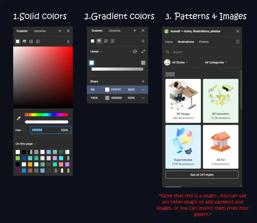
- Solid Colors: Use your brand colors or complementary shades. Try to use the colors that align with your brand.
- Gradients: Use a mix of 2 or more than 2 colors to create a gradient background.
- Patterns: Design or import patterns using plugins or shapes tool that align with your brand’s aesthetics.
- Images: Use high-quality HD images as backgrounds. Adjust the opacity or apply filters to ensure the text attracts attention. You can use features like masking for more advance designing.
Figma’s gradient tool and extensive color options make it easy to create stunning backgrounds.

🌟Adding and Styling Text
Text is an important feature in your design. The first attention of a user generally goes to what’s written on your post. Using a trendy typography and the right colors will bring you more views and attention. Here are some important tools and aspects you should use in your posts:
- Text Tool: Use the text tool to add heading, subheadings, paragraphs and important highlights. Resize the text by adjusting the vertices of the text box, and increase/decrease the font size from the inspect panel, or you can simply use the shortcut ctrl + shift + >.
- Typography: Stay updated about the trendy fonts, incorporate them in your designs. Although Figma contains a large variety of fonts , as you will explore you will get to know. Use a font that aligns with your brand aesthetics, grabs attention and stands out.
- Hierarchy: organizing your content within the design is very important. Typography hierarchy is one thing that a designer should learn and keep in mind!
The headings should be large and bold in size, the subheading must be smaller than headings, and the paragraphs the smallest. Than you can also add contrast headings in between to grab attention. The less important paragraphs can written in a light color and the more important ones in dark. - Alignment and Spacing: The alignment and spacing of the text is something which most people forget to add. The design you create should not only be creative and attention grabbing but also clean. Figma contains alignment options such as center align, left align or right align and more..
These are some alignment options that Figma has, try them one by one and you will know what use they have.

.
🌟Incorporating Graphics and Illustrations
Adding graphics and illustrations into your posts can make them more engaging and attention grabbing. Picturizing a content makes it more attractive and easy to understand. You must have seen most of the Instagram posts contains visually appealing and attractable graphics, illustrations or pictures. That is because people are lazy, we are lazy, we tend to watch rather than read, and our goal is to make our Instagram posts stand out in the crowded feed. That would only be possible when we fulfil what the audience out there really needs and what suits there comfort zone.
Figma has many tools and plugins that allows you to incorporate stunning graphics and illustration in your posts:
- Pen Tool: The pen tool in Figma can be used to design custom shapes and icons, you can adjust the points and create different kind of shapes with it.
- Plugins: Figma has a huge variety of plugins for graphics and illustrations like streamlinehq, icons8, Blush and more… These plugins contains aesthetic and creative illustrations, icons and a lot of other graphics which will add 5 stars to your post.
- Importing: you can also import illustrations or graphics from outside, like Pinterest or any other platform that you like. This would also open many choices to you, as plugins in Figma are limited i.e. they only provide free illustrations for a limited period of time, after that you need to buy their premium subscription and stuffs like that.
🌟Interactive Prototyping
In the design procedure, Interactive prototyping plays as a game-changer for Instagram posts, as it allows the creators to envision and experiment their ideas before making the post live. By using Figma and other design tools, designers can make interactive prototypes that can imitate the user experience of engaging with content, swapping through the posts, and scrolling through the feed or reels. This activity not only will help in increasing engagement towards your post and making a strong brand identity but also help in testing the potential of your post , the interactivity that you can bring by making post aesthetic and user experience good.
Some features of Figma that will aid in interactive prototyping:
- Smart Animation : This feature allows you to insert animations and transitions between frames. For example, if you want to show how to login to your website by clicking the call to action button, than you can use this feature of Figma. You can watch this 8 minutes tutorial of smart animation by the Figma community on Youtube:
- Interactive Components: This feature allows you to create elements that can be reused and will behave consistently across all of your designs.
- Clickable Elements: This feature helps in simulating user’s interactions by adding interactive hotspots and buttons.
- Prototyping Links: This provides shareable links that can used to test users and feedback collections.
🌟Collaborating & gathering feedback
Collaboration and gathering feedback is very essential when you are branding through Instagram posts. All the stakeholders have different say and different views of designing, but their opinion matters too. It will also reduce the need of revisions as much as it will fulfil their expectations.
Figma provides collaboration features through which you can get reviews on your design and make it meet their expectations:
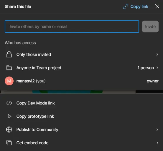
- Shareable links: You can collaborate by sharing the link of your file with your fellow colleagues or designers. This will allow them to make changes in your design and also add reviews to it. To know more about sharing you can read our blog : ‘Figma Basics Tutorial: A Creative Guide for Beginners’

- Comments : comments tool can be used to leave feedback directly on the design . It will appear something like this in the Figma file.

🌟Exporting & optimizing for Instagram
Once you are done with completing your design and reviewing it from your colleagues or seniors, you will need to export it in the right format:
- Export Settings : Choose the JPEG or PNG format for the images, PDF for multiple images or presentations, MP4 or GIF for animations or videos.
- Resolution : Don’t forget to set the resolution 1080×1080 pixels. It will maintain the quality.
- File size : Adjust the file size according to your need , but make sure to maintain its quality. Figma has many options to adjust the quality and format to achieve the best balance.
🌟Conclusion
Lastly, designing Instagram posts that stand out in the feed can be a challenging task, but if you have the right knowledge and the right resources you can definitely bring out magic! Figma has a collection of tools that are both effective and time-saving. They also allow you to improve the designs.
The thing is to be consistent and keep learning and practicing to stay ahead in the ever-evolving feed of Instagram.
Whether you are a professional designer or just a content creator trying to make your posts look eye-catching, these hacks will help you make Instagram posts that will not only look good but also increase engagement and growth! Happy designing🙌


