For making your brand stand out, a well-built and eye-catching business logo is very crucial. In this blog, you will get an inclusive insight on creating your first business logo. A design that will communicate your business value and message to the targeting audience.
Understanding the basics of logo design
A good logo doesn’t means lots of designing and illustrations. A good logo is one which represents your brand , so it should be simple, memorable,
relevant and versatile. The simpler the business logo, the more recognizable it becomes. Memorability ensures that it stays in the mind of the audience.
Relevance ensures that the logo makes some sense and represents your brand’s message and versatility ensures that it looks good on all platforms whether someone views it in a tab, app, or an laptop.
Research & Inspiration
Researching about the industry trends and your competitors is as much important as the design process. Doing this gets you an idea about the what’s and what’s not in your field. See around what other successful companies have made their logos, noting their each and every details. Researching like this will help you understand the trends of design and understand the visual language of your industry.
Defining your brand identity
Your logo should always reflect your brand. It should symbolize your brand’s aim, value and identity. Start by throwing light on these facets.
Ask questions to yourself like, what principal message you want to convey? What is your target audience? What brand mission do you want to set?
Finding answers to these questions will guide your design possibilities. Try to keep the style, tone and vibe according to your brand i.e. modern, simple, solid,
playful and sophisticated.
Sketching, Colors & Typography
Don’t just start designing directly on your PC. Start by brainstorming and doodling initial ideas on a paper or a board. The aim is to explore as many options and ideas you can and confine your choices down to a few strong ones. This continuous process will help you filter your thoughts and reach to a final design decision.
Colors and font plays a crucial role in your brand’s identity. The logo should be aligned to the colors, theme and mood of your brand. For example , if your brand is say for educational purposes, then the font of the logo should not be a funky one rather it should be sophisticated. But on the other hand if your brand is of a restaurant than it can be funky or sophisticated according to the vibe of the brand or restaurant.
The color palette for the logo should also be chose wisely according to the theme of your brand’s website or identity.

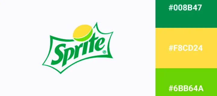
In the above image you can see how smartly the designer has chose the color palette and typography according to the product the brand is selling. #008B47, #F8CD25 and #6BB64A, the colors which are reflecting lemon and freshness, which is the core element in their products. So this is how you can smartly chose the colors and typography for your brand’s logo.
Digital Creation, Feedback & Finalizing
Once you have done all the above processes and finalized your idea start designing it on any software like Adobe Illustrator or Figma. Make sure that your logo is scalable i.e. it looks good in all sizes, from a small icon on website to billboards.
Once you are done from your side, start collecting feedbacks from your teammates, mentors or your peers to refine your design and arrive at a good and strong final product.
After finalization, export your design in all important formats like PNG,SVG, JPEG to ensure adaptability across all platforms. Check by implementing it on mock websites, print materials and billboards and ensure that it looks good in all forms.
Following the above tips and design rules, you will definitely create a logo that resonates with your brand and also attracts audience. Keep designing and reading our blogs!


